






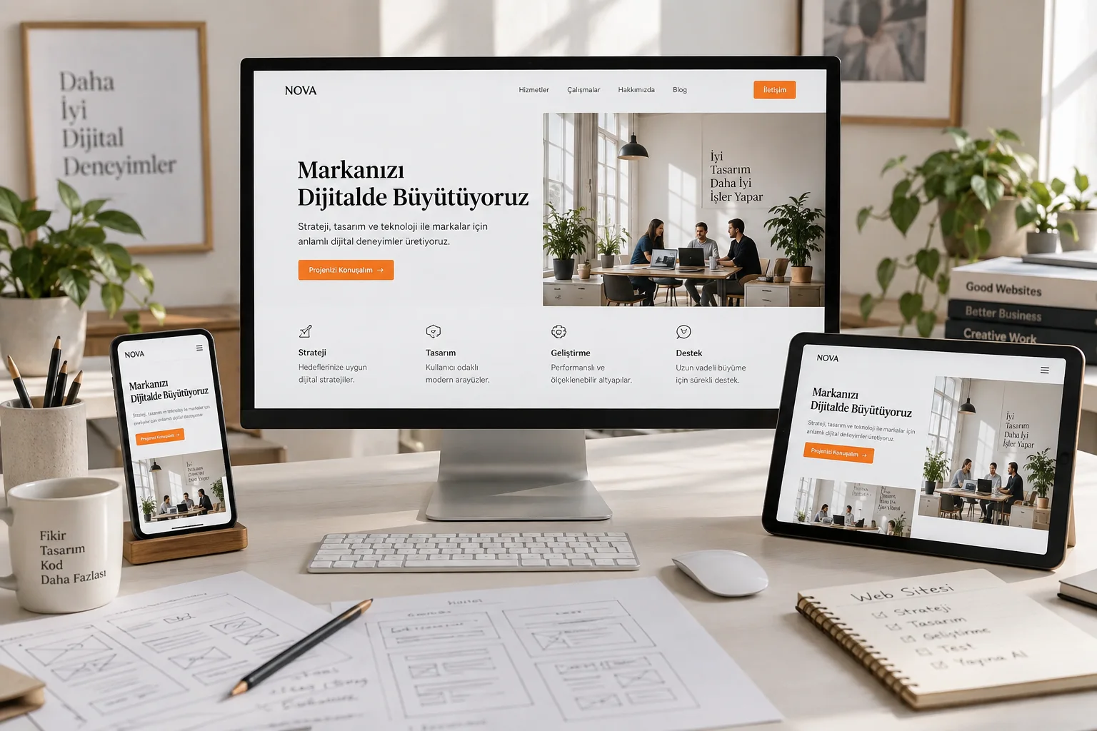
1. A clear purpose
Before designing, decide what the website needs to achieve. A consultancy may prioritise meeting requests; a manufacturer may need to explain its expertise and services. Give each page a purpose: what should visitors learn, and what should they do next?
This decision makes navigation and headlines easier. A service page explains the service, shows the scope and offers a natural route to contact.
2. Clear navigation
Organise the menu around the information visitors seek. Familiar labels such as About Us, Our Services and Contact make destinations predictable. Creative titles should still explain what the link opens.
List your pages and group related subjects. Avoid hiding important information behind several menus. A simple structure also supports a growing website.
3. A visual language that belongs to your brand
Good design goes beyond fashionable colours and large headings. Fonts, photography, spacing and buttons should express the same brand. Readable content matters as much as an impressive effect.
Choose a main font, heading weights, a few surface colours and an accent colour. Apply those decisions consistently across pages so every section feels part of one website.
4. Comfortable mobile use
A website should be as comfortable on a phone as on a computer. Review heading breaks, menu behaviour and form fields on small screens. Visitors should not need to zoom to call or complete a form.
Check internal pages too. Long service names, wide tables and card layouts can behave differently. Test with real content rather than empty boxes.
5. Speed and accessibility
Oversized images and heavy effects can make content harder to reach. Prepare images for their displayed dimensions and limit unnecessary motion. Information should not wait for an animation to finish.
Use headings for headings, links for navigation and buttons for actions. Form fields need visible labels and keyboard access. MDN’s HTML accessibility guide explains why this structure matters to assistive technologies.
6. Content that answers questions
Describe what you offer, how you work and what is included rather than relying on broad promises. Visitors need to understand the process, deliverables and expectations.
Read every page with these questions: who is this for, what problem does it address, and where should I start? Add missing answers and avoid repeating the same sentence under different headings.
7. An easy next step
Place contact options where visitors need them. A short form, clear email address and meaningful button text make the transition from reading to enquiring easier.
You do not need every feature at once. Start with the essential pages, useful content and a clear contact journey, then expand according to use. Our web design service considers visual direction, structure and usability together.